Case 01 · 2024
Scroll to play
TSA
Verify
Category
UX/UI Design · Deloitte × SCADpro
Services
UX Research · UI Design · Prototyping · Systems Design
Overview
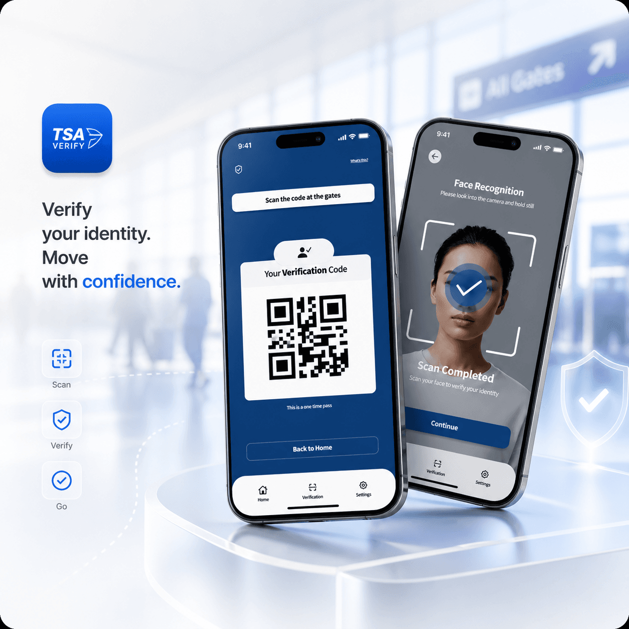
Two apps. One system. Built to move 30,000 passengers through faster.
TSA Verify reimagines the airport checkpoint for the two people who live it — the traveller and the officer. The problem was concrete: 67% of travellers didn't know Real ID was required until they were already at security. Partnering with Deloitte, I led UX across both the passenger app and the officer dashboard.
The central challenge was designing for two completely opposite mental models within one system: a security officer processing hundreds of people per shift under time pressure, and a traveller navigating the checkpoint for the first time. The same information, completely different needs.
I built a pre-verification flow that moves the hard part upstream — before the airport, before the stress. Upload, verify, go. The officer app on the other side was built for speed: large tap targets, colour-coded queue status, one-tap verification. Zero reading required under pressure.
Stack
Mobile UX · Figma · Dual-Audience Design · Systems Design
UX Design
User Research
Journey Mapping
Prototyping
Usability Testing
Systems Design
Dual-Audience System
Interaction Design
Accessibility
The product
Screen by screen.

The Problem
78-minute checkpoint waits at peak. Officers running paper-based queues with no digital tools. Travellers arriving with no idea what documents they needed or why the line wasn't moving. The system was broken for both sides — and no one was connecting them.
Who it's for
Two audiences with completely opposing mental models: TSA security officers processing hundreds of passengers per shift under real time pressure, and air travellers — frequent fliers and first-timers — moving through a process they don't fully understand.
What they needed
Officers needed speed above everything else: large tap targets, no reading, instant status feedback. Travellers needed clarity and reassurance: step-by-step guidance, visible progress, and a sense of control in a high-stakes process they couldn't prepare for.
User Flow
How they move through it.
The whole system was built to move the hard part — identity checks — upstream, before the airport.
The passenger app
One screen. One decision. No confusion.
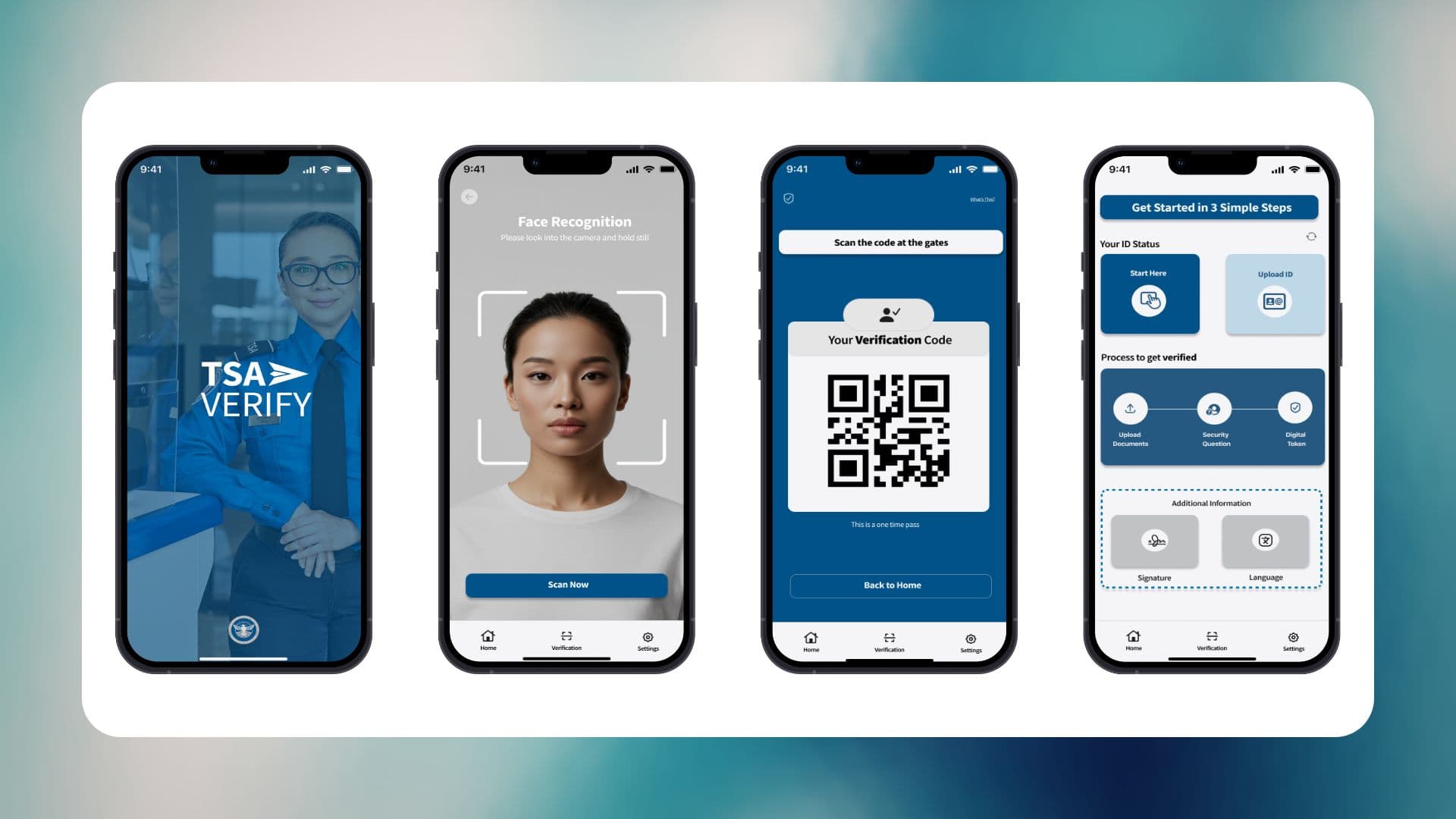
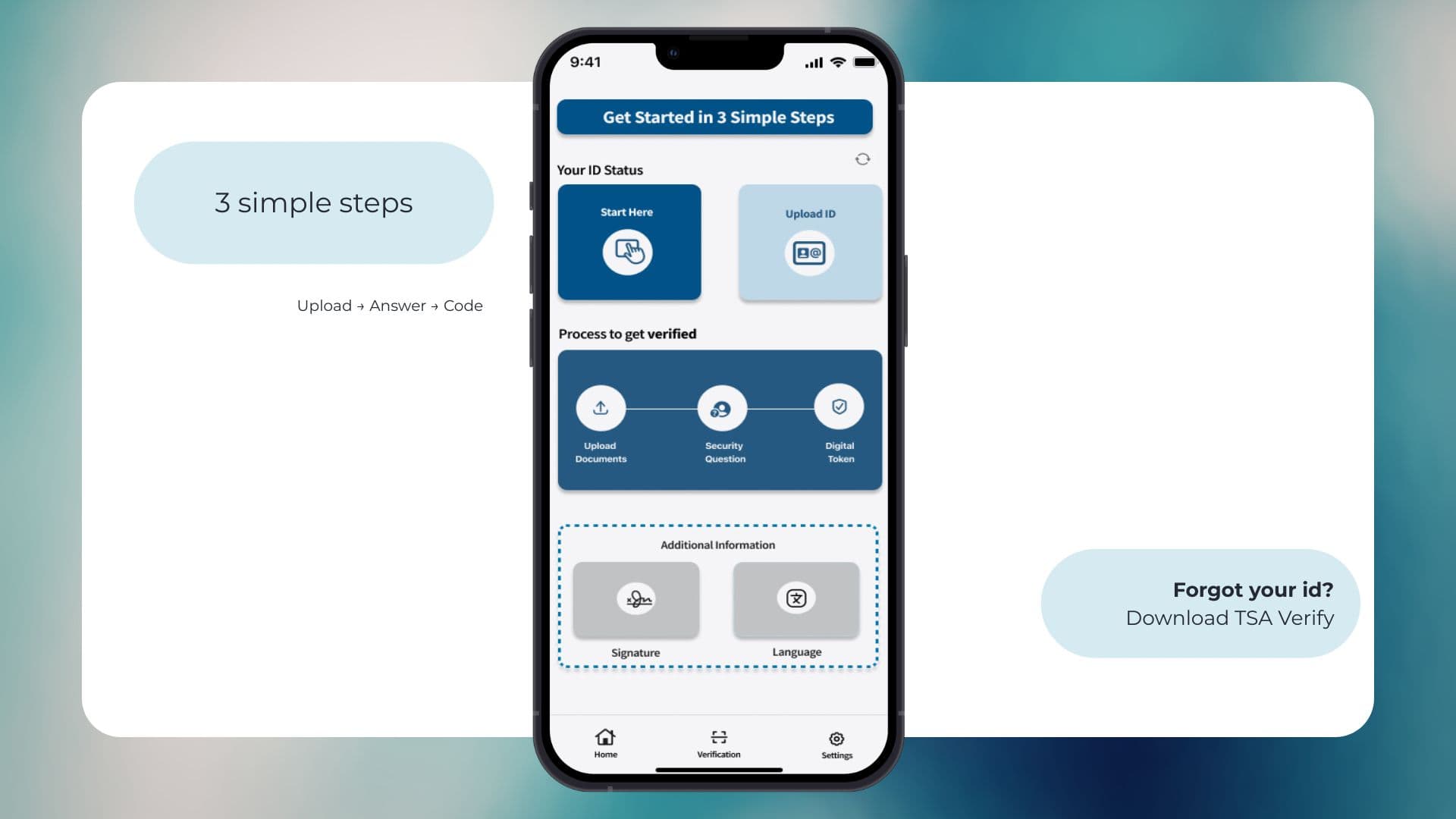
The pre-verification flow moves the hard part upstream — before the airport, before the stress. Upload documents, confirm identity, complete face scan, receive result. Every screen earns the next one. No dead ends, no ambiguity about what happens next.
Open full prototypeThe officer experience
Built for eyes-up operation under real pressure.
The officer dashboard was designed for one thing: speed under pressure. Large tap targets, colour-coded queue status, one-tap identity verification. Minimal reading. Maximum throughput. The officer never has to look away from the passenger to use it.
Open full prototypeGoals
What we were solving for.
Cut average checkpoint wait time by 30% through mobile pre-verification
Give officers a real-time dashboard to manage queue flow and identity checks
Reduce passenger anxiety through proactive communication and pre-submitted documents
Validate a digital-first TSA checkpoint experience that could scale nationally
Deliver a high-fidelity prototype ready to present to TSA leadership at Deloitte
Research
I spent three peak-hour sessions at two US airport checkpoints — not behind glass, in the queue — watching how officers and passengers actually behave under pressure. Then 8 officer interviews with one core question: what would genuinely help? Plus a 120-person traveller survey on anxiety triggers and digital readiness. The answer came from every direction: everyone needed more information before they arrived.
8 TSA officer interviews across two major US airports
120-traveller survey on checkpoint anxiety and pre-check willingness
Contextual observation across 3 peak-hour sessions at live checkpoints
Service blueprint mapping the full end-to-end checkpoint flow for both users
Competitive analysis of Singapore Changi and Schiphol digital programs
Cognitive load audit of existing TSA documentation and officer tools
What We Delivered
Key features.
Pre-Check Document Submission
Passengers submit ID and boarding pass digitally before arriving — eliminating the fumbling moment at the checkpoint entirely.
Live Wait Time Indicator
Real-time queue status so travellers can choose the right lane and arrive with realistic expectations.
Officer Dashboard
Built for eyes-up, high-pressure operation — large tap targets, colour-coded queue status, one-tap identity verification. Minimal reading required.
Identity Verification Flow
Biometric and document cross-check surfaced in a single screen, cutting officer cognitive load and reducing verification time.
Checkpoint Status Alerts
Push notifications alert passengers when their lane is ready — reducing crowding and the chaos of ad-hoc queue movement.
Accessibility-First Design
Both apps designed to WCAG AA — large text, high-contrast states, and voice-guided passenger flows for reduced-vision users.
Future State
Where it goes next.
This deck extends the system beyond the prototype — mapping national rollout architecture, multi-airport scalability, and the next phase of features proposed for federal deployment.
National rollout architecture and multi-airport scalability framework
Next-phase features: biometric auto-clear, AI-driven queue prediction
Federal deployment pipeline and stakeholder handoff playbook
Full Design Documentation
Full Process Book
78 pages documenting every decision behind the system — from initial research through to the final Deloitte handoff.
Dual-audience research synthesis and user journey maps
Complete design system for both officer and passenger apps
Usability testing results and iteration rationale across 3 rounds
High-fidelity prototype documentation and handoff specs
The Result
High-fidelity prototypes for both officer and passenger apps. Full process book. XR studio presentation to Deloitte. 30K+ target users. Four deliverables, one complete system.
Final Presentation
Deloitte × SCADpro — Final Presentation
The live stakeholder presentation delivered to Deloitte leadership. Full walkthrough of the TSA Verify system — research findings, design decisions, and both high-fidelity prototypes.
Autoplays muted when in view · unmute with the controls
