Case · 07 · 2025· Designer & Developer
Edukinect
Category
Web Design · EdTech & AI
Services
Web Design · UX Strategy · Development
Client
Edukinect
Overview
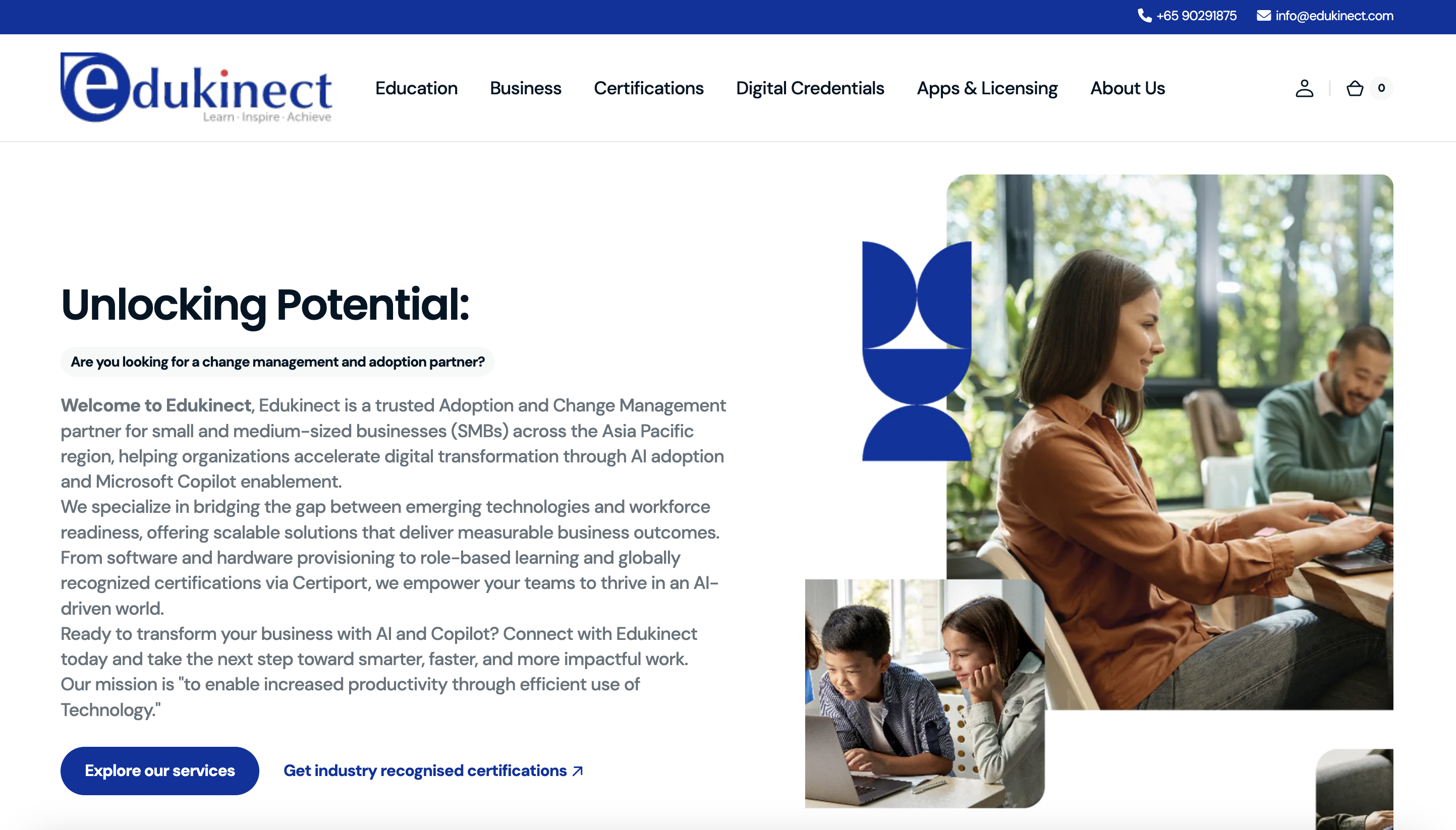
We surfaced their Microsoft credential where decision-makers actually look.
EduKinect had one credential their target audience specifically searches for when evaluating AI transformation partners: Microsoft. It was buried in the footer. The rest of the site read like every other IT consultancy. I fixed that.
I ran 6 interviews with SMB decision-makers who'd recently evaluated AI partners. Their evaluation order was consistent: credentials first, sector relevance second, outcomes third, price last. The site was failing at the first three. The redesign put Microsoft front and centre and rewrote every service description in the language of the decision-maker, not the IT team.
Stack
Next.js · Tailwind CSS · AI & EdTech · Conversion Design
Strategy
UX Strategy
Audience Mapping
Content Architecture
Development
Website
Performance Optimisation
SEO
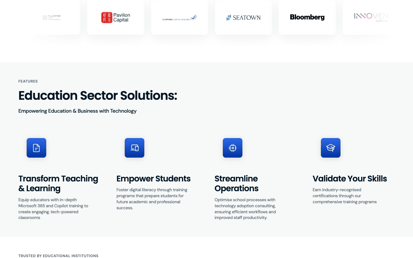
The Problem
EduKinect’s strongest credential — Microsoft partnership — was buried in the footer. The rest read like every other IT consultancy.
Who it's for
SMB decision-makers across Asia Pacific — CEOs, COOs, and HR Directors at 50–500 person companies beginning or accelerating their AI adoption journeys. Primarily Microsoft ecosystem users evaluating Copilot enablement partners.
What they needed
Measured, results-oriented buyers. They respond to credentials, clear outcomes, and specific sector expertise — not generic technology promises. They need to see Microsoft partnership proof and real case outcomes before they engage.
User Flow
How they move through it.
Buyers evaluate in a fixed order — credentials, fit, outcomes — so the flow follows it exactly.
The positioning
Microsoft front and centre. Finally.
The website
Built for the decision-maker, not the IT team.
Brand Identity
Palette
Typography
AI-ready. Certified.
Outcome-led transformation.
Brand In Use
Office signage Brand application
 Brand mark
What I Built & Why
The decisions behind it.
Microsoft above the fold
The primary buy signal, surfaced in the first viewport.
Dual-intent routing
Two CTAs split “just starting” from “accelerating” buyers.
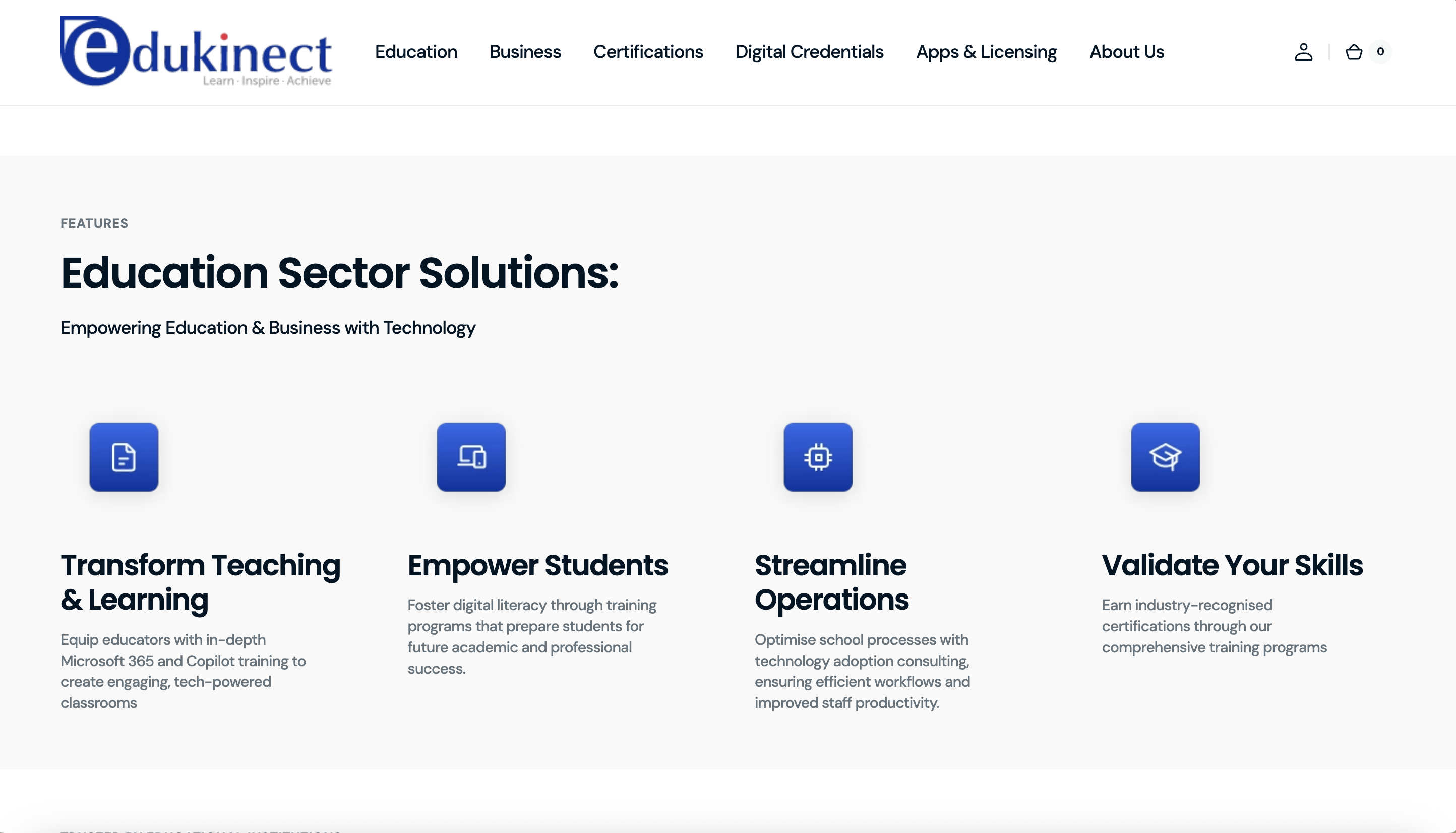
Sector landing structure
Industry pages target high-intent APAC adoption search.
Principles
Gallery
The delivered work.
Scroll to explore · click to zoom