
Deloitte × SCADpro · Flagship
Designing TSA Verify — a dual-audience system for travellers and TSA officers — in partnership with Deloitte.
Overview
By December 2024, travellers without a REAL ID-compliant document had one option: a call to the National Transportation Vetting Center, already averaging 903 calls a day. As UX/UI Designer and Client Program Lead on a 17-person, Deloitte-sponsored SCADpro studio, I designed the passenger-facing verification app end to end and contributed to the officer-facing pass/fail concept.
Role
UX/UI Designer & Client Program Lead
Timeline
Spring 2025 (16 weeks)
Team
17-person cross-disciplinary studio
Achievement
903/day
Baseline verification calls the app targeted
16
Production screens designed, passenger app
A+
Deloitte stakeholder reception
Problems
Officers ran paper-based queues with no digital tools. Travellers arrived with no idea what documents they needed. Neither side was connected to the other.
Officer Issues
Paper-based queues, no digital tools
Traveller Issues
No pre-trip information
No connection
Neither side informs the other
The result
Long waits, stressed travellers, overwhelmed officers
Solution
TSA Verify lets travellers pre-verify their identity before they arrive, and gives officers a one-tap pass/fail signal — so the checkpoint starts already resolved.
Pre-verify before arrival
Upload, confirm, done — before the airport
Move with confidence
Checkpoint starts already-cleared
Final App Design Highlights
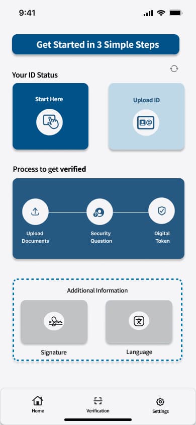
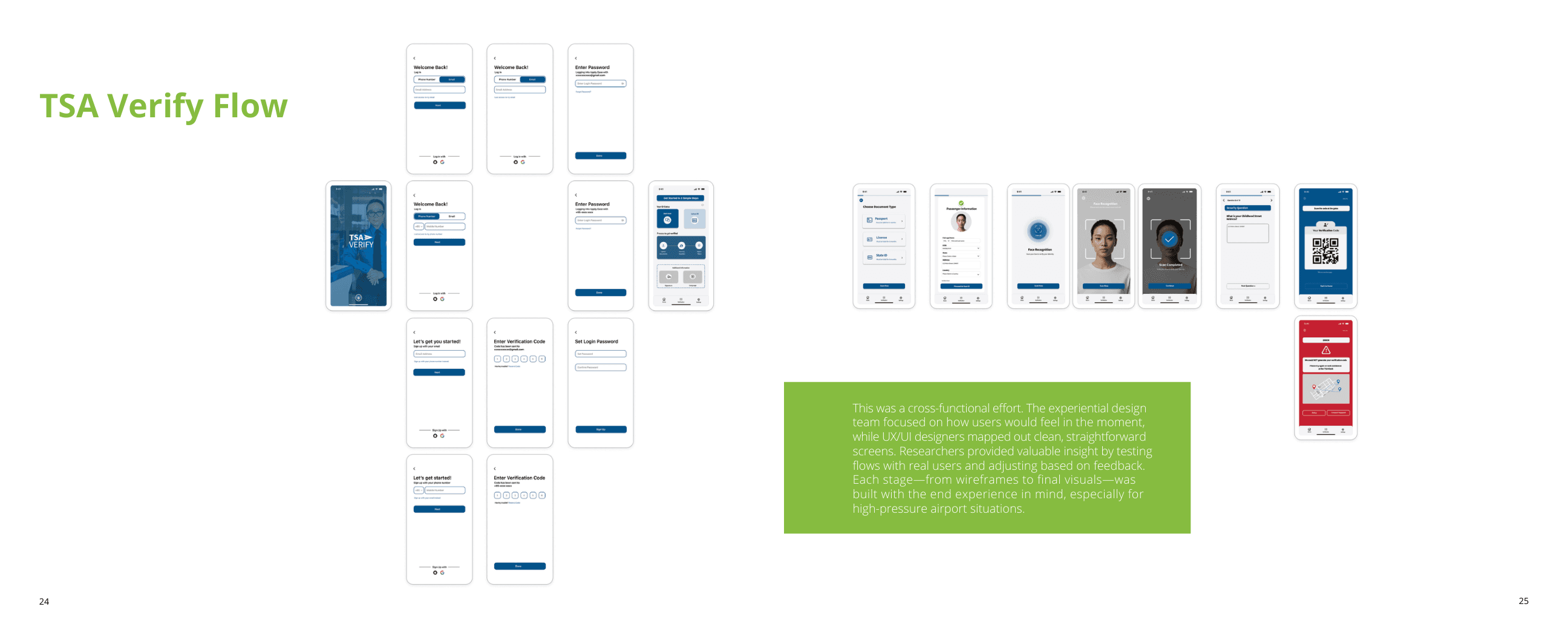
A guided landing flow with a clear three-step promise — upload documents, answer a security question, generate a digital token — so travellers know exactly what's ahead before they begin.
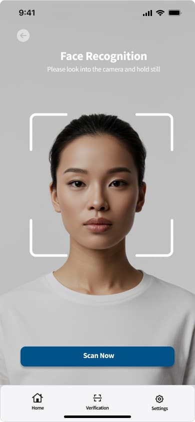
Documents, a security question, and a face scan — one field at a time, so nothing feels overwhelming. Each step confirms progress before moving to the next.
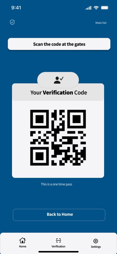
A one-time QR code and pass status the officer can verify in seconds — no paper, no repeated questions, no ambiguity about what happens next.
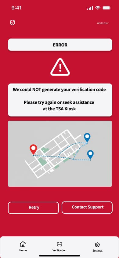
A failed scan was designed with the same care as a successful one: Retry, Contact Support, or a mapped route to the nearest TSA kiosk — never a dead end.
Challenges
REAL ID enforcement began May 7, 2025 — set by federal law, not the studio's own schedule. Every round of iteration had to fit inside that fixed window.
Officers needed speed and zero reading under pressure; travellers needed reassurance through an unfamiliar process. The same underlying data had to serve both without compromise.
Research Insights
67% of travellers didn't know REAL ID was required until they were already at security — the awareness gap was as big a problem as the verification itself.
Officers process hundreds of people per shift under real time pressure. Any solution that required reading was a solution that would get skipped.
The National Transportation Vetting Center was averaging 903 calls a day before enforcement even began — projected to reach 90,000 a day after.
REAL ID compliance was as low as 17% in some states, meaning a large share of first-time users would need a genuinely no-friction first experience.
Prototyping & Testing
The interactive Figma prototype went through usability testing with 12 participants across 3 rounds — each round feeding directly back into the next pass of the passenger and officer flows before final handoff.
The Officer App
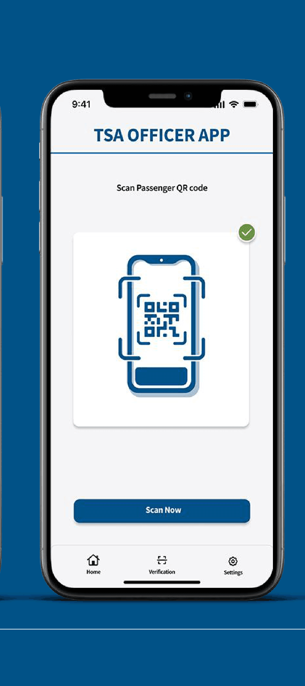
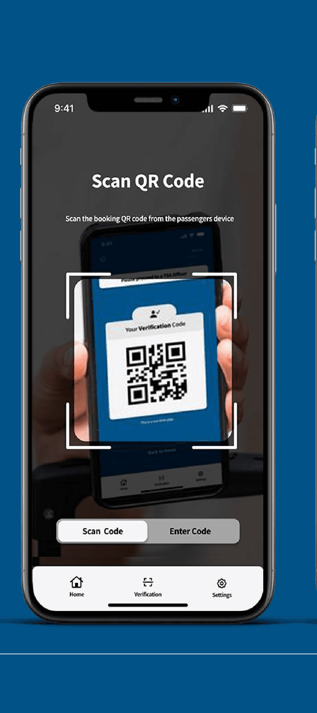
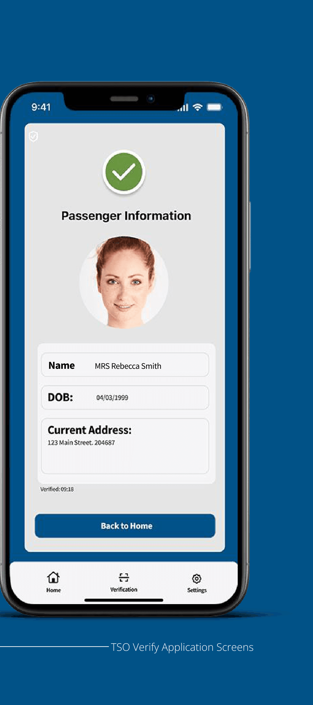
The officer never types. Scan the passenger's QR code, the system cross-checks their pre-verified identity, and a pass/fail result appears with the traveller's name, date of birth, and address — verified in seconds, not minutes.
Go-to-Market
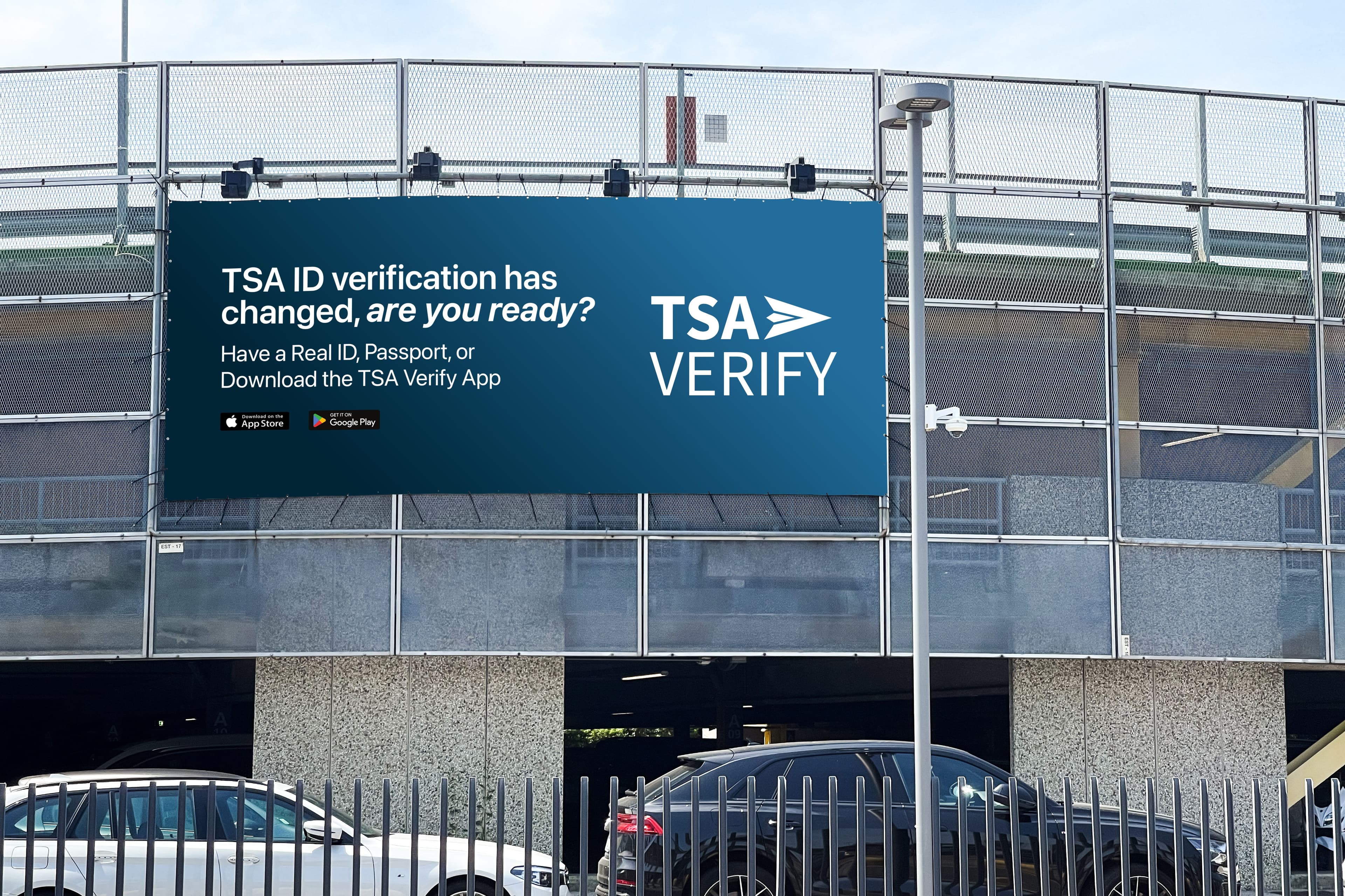
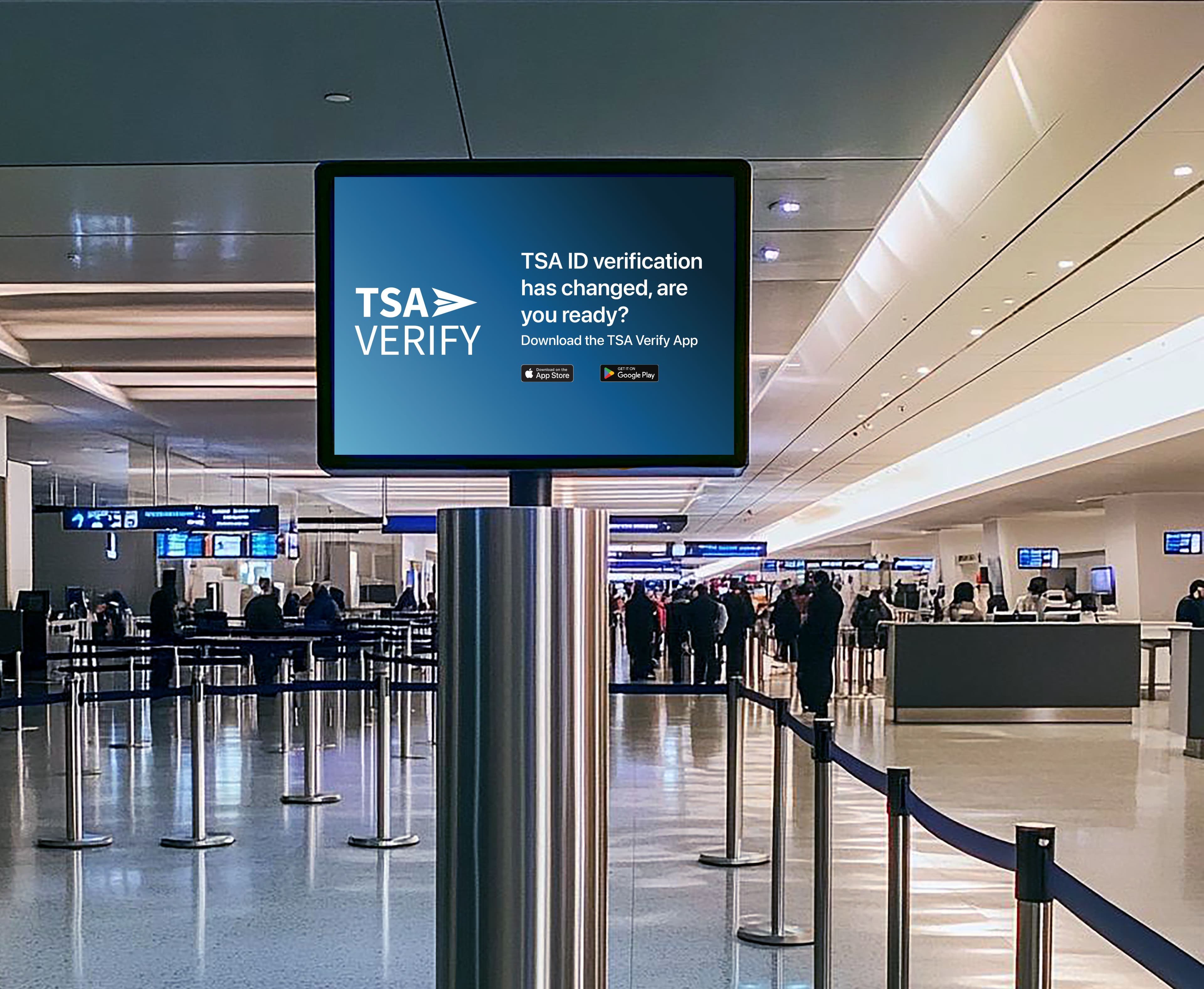
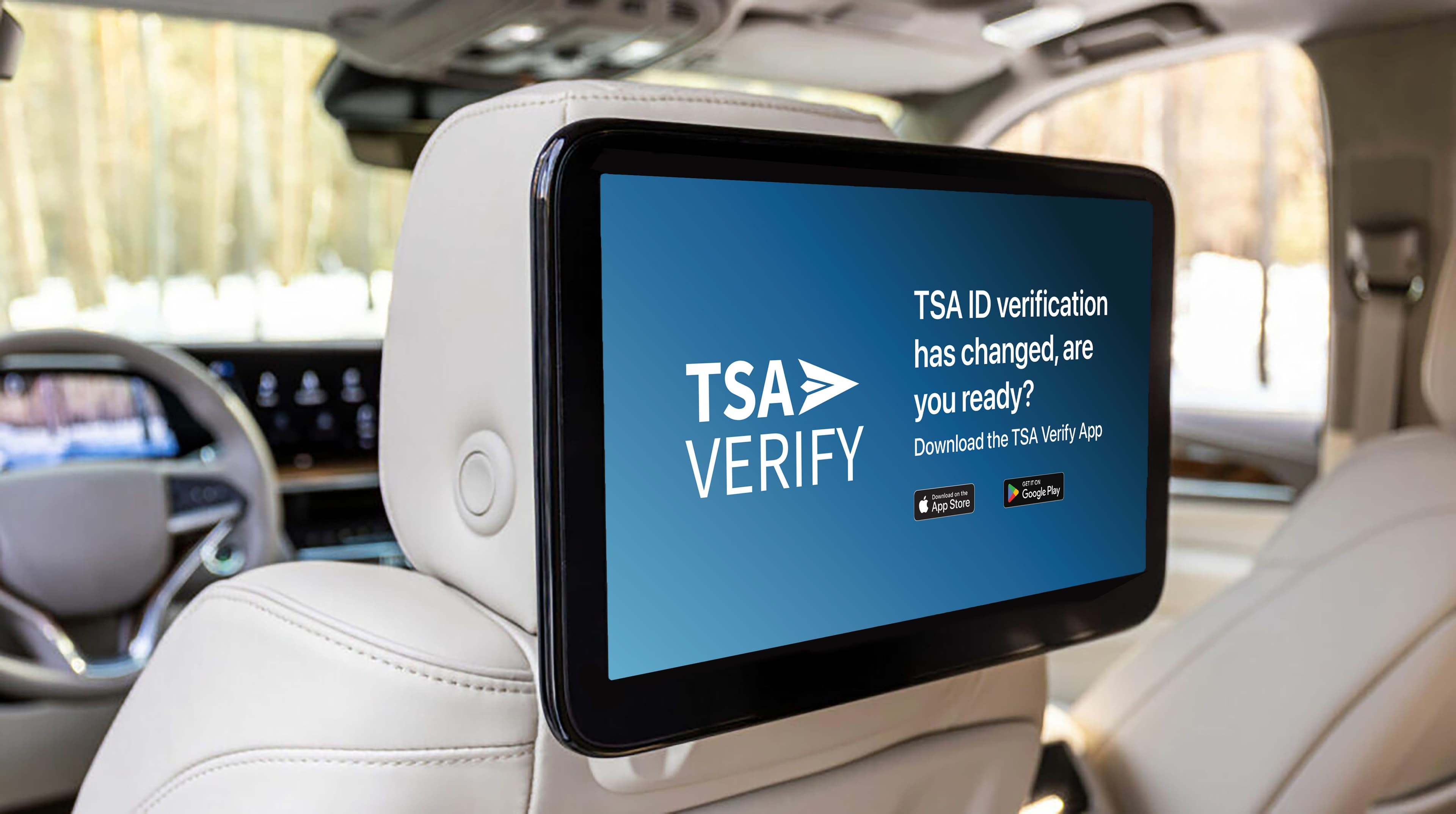
OOH billboards, in-terminal signage, and rideshare screens — geo-targeted at the lowest REAL ID compliance states — reinforced the same message at the moment travellers needed it most.
Design System
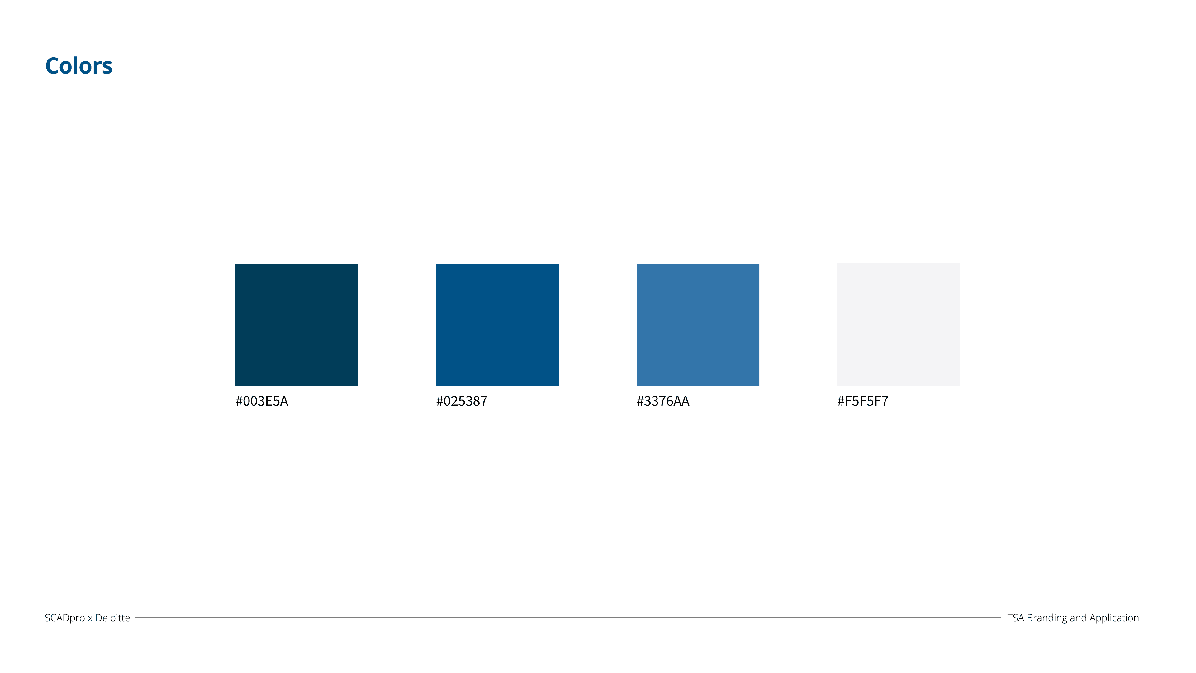
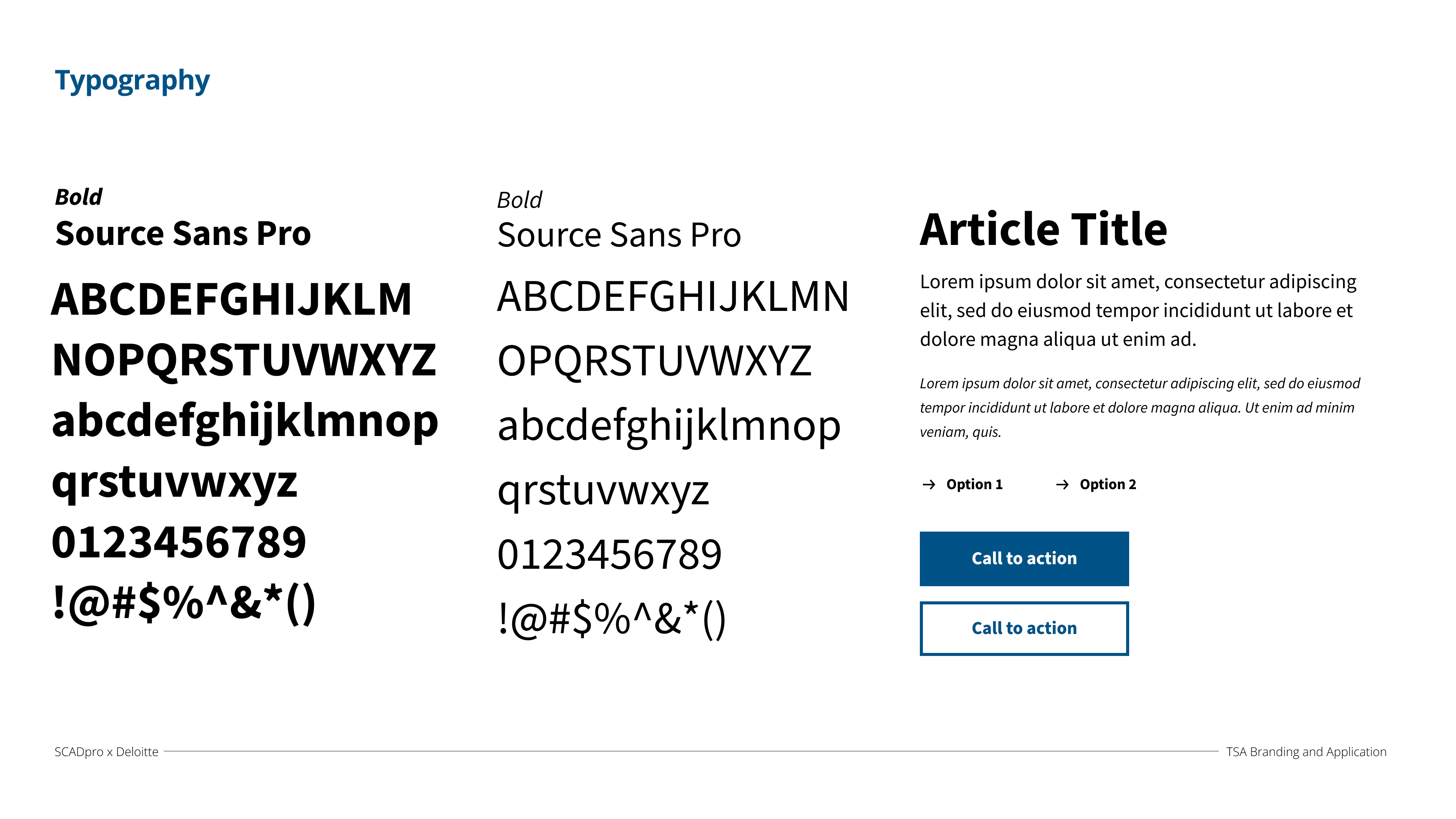
A four-colour palette and a single type family carried across both the officer and passenger apps — the same visual language flexing across two completely different interaction patterns.
How It Was Run
Weekly reviews kept 17 people aligned to Deloitte's objectives and the fixed federal deadline. Presented final research, rationale, and prototypes directly to Deloitte leadership.
Experiential design, UX/UI, and research worked as one pipeline. Coordinated with the campaign team so the app and public-awareness push landed together.
WCAG AA baseline: high-contrast states, large tap targets, guided one-field-at-a-time flow. Officer interface reduced to colour + icon only.
Failed verification routes to Retry, Contact Support, or a mapped route to the nearest TSA kiosk. Designed for zero pre-verification — the officer flow never assumes the app was used first.
— The Final Presentation
The presentation delivered to Deloitte leadership — the full walkthrough of the TSA Verify system, from officer workflow to passenger verification.
Conclusion
TSA Verify moved identity verification upstream — before the airport, before the stress — for two audiences with completely opposite needs, built to a federal deadline neither the studio nor Deloitte could move.