
SCAD Interactive Design · Solo Project
A mobile app for tracking internship and job applications — researched, designed, and built solo, end to end.
Overview
Existing tools (ClickUp, Monday.com, Wrike) were built for team project management, not a single job seeker. I owned the full process solo: research, personas, information architecture, wireframes, prototyping, visual design, and usability testing.
Role
UX/UI Designer & Researcher
Timeline
Spring 2024, one academic term
Team
Solo — research through final screens
Achievement
60%
Improvement in task-organisation efficiency (user-tested)
20+
Student users engaged directly during research
3
Design rounds, each shaped by real testing
Problems
Every existing option was dense and team-oriented — built for coordinating groups, not for one person tracking their own applications.
Team tools
ClickUp, Monday, Wrike
Feature-heavy
Built for groups, not one user
Doesn't fit
No tool built for a solo job search
The result
Missed deadlines, lost materials
Solution
A dashboard, tracker, calendar, and file library unified around a single status language — readable at a glance, understood on first open.
One status language
Submitted → Under Review → Interview → Rejected
Understood instantly
No onboarding tutorial required
Final App Design Highlights
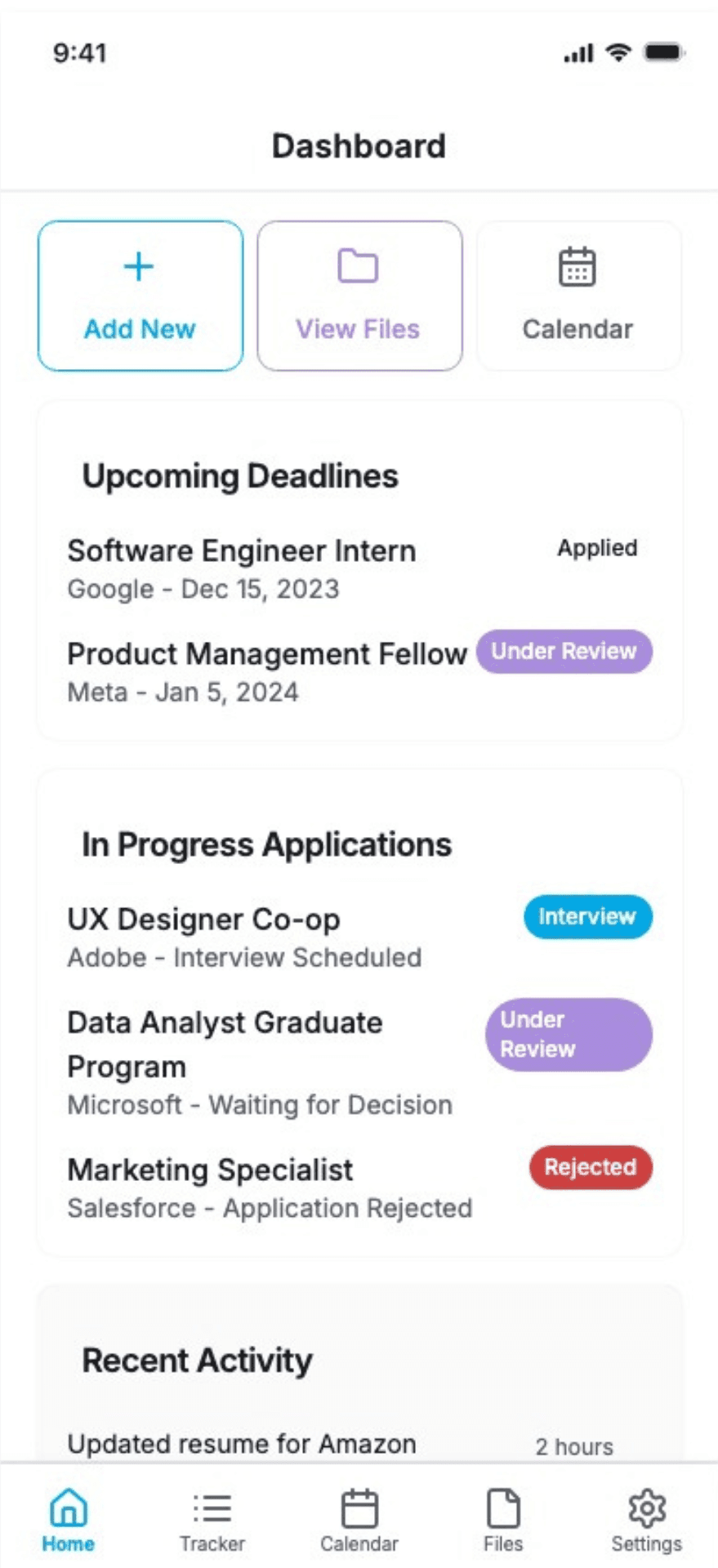
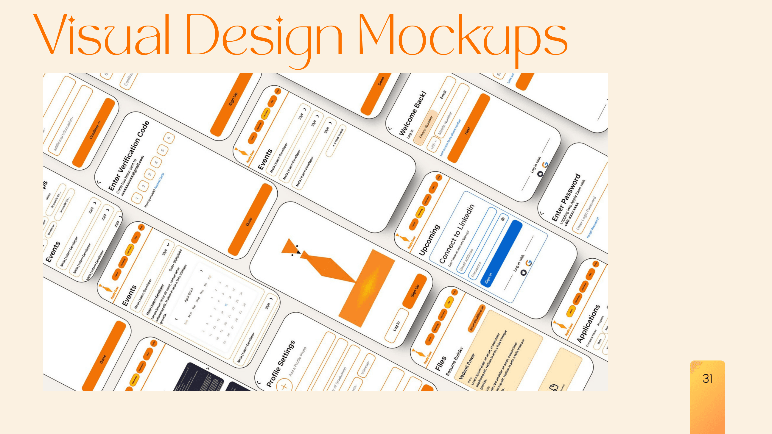
Upcoming deadlines and in-progress applications surfaced first — the two things a job seeker checks every day, front and center.
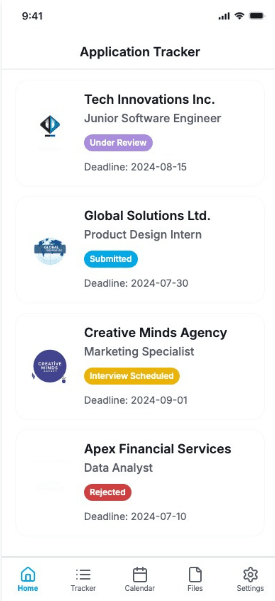
Every application in one list with a colour-coded status — Submitted, Under Review, Interview Scheduled, Rejected — reused identically everywhere else in the app.
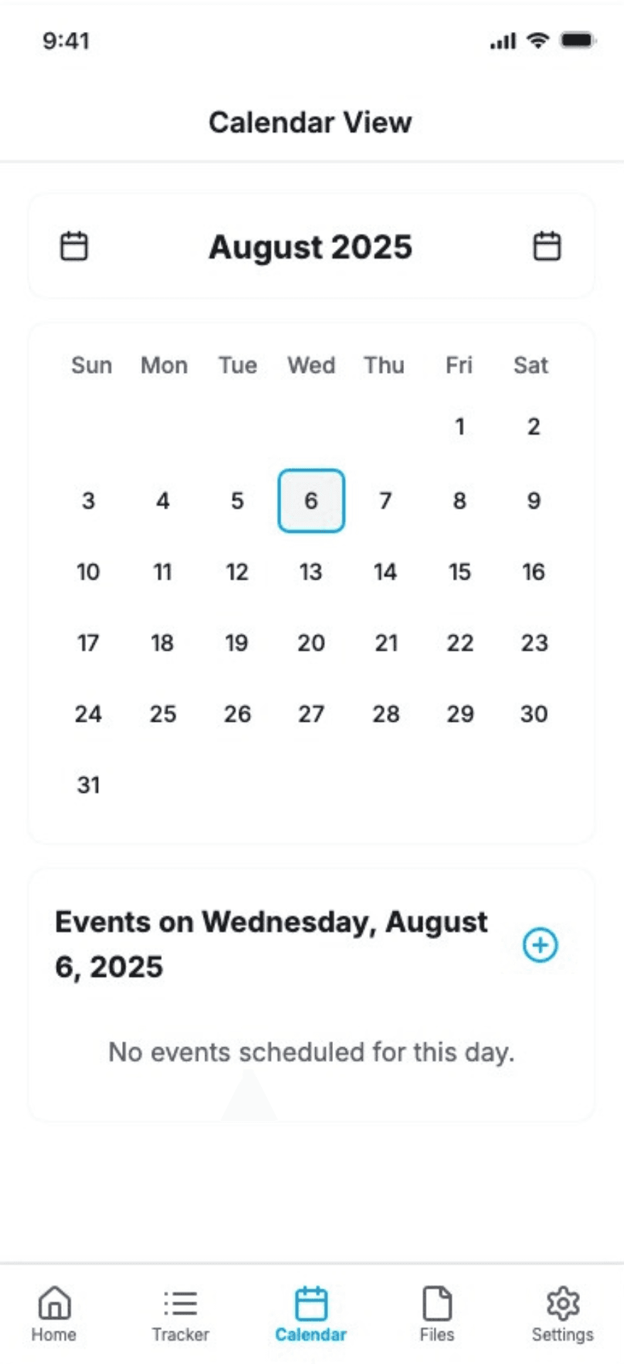
Deadlines and interviews mapped to a real calendar view, so nothing gets missed by living in a separate app.
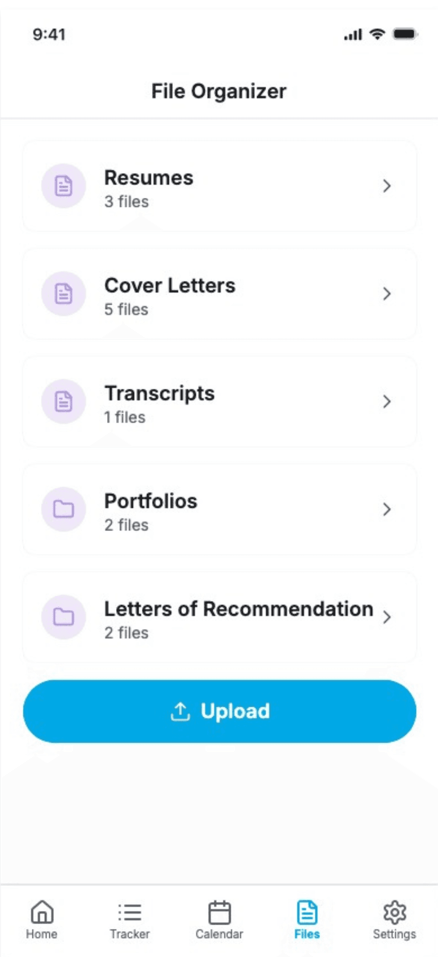
Resumes, cover letters, transcripts, and portfolios sorted into one library instead of scattered across email and downloads.
Challenges
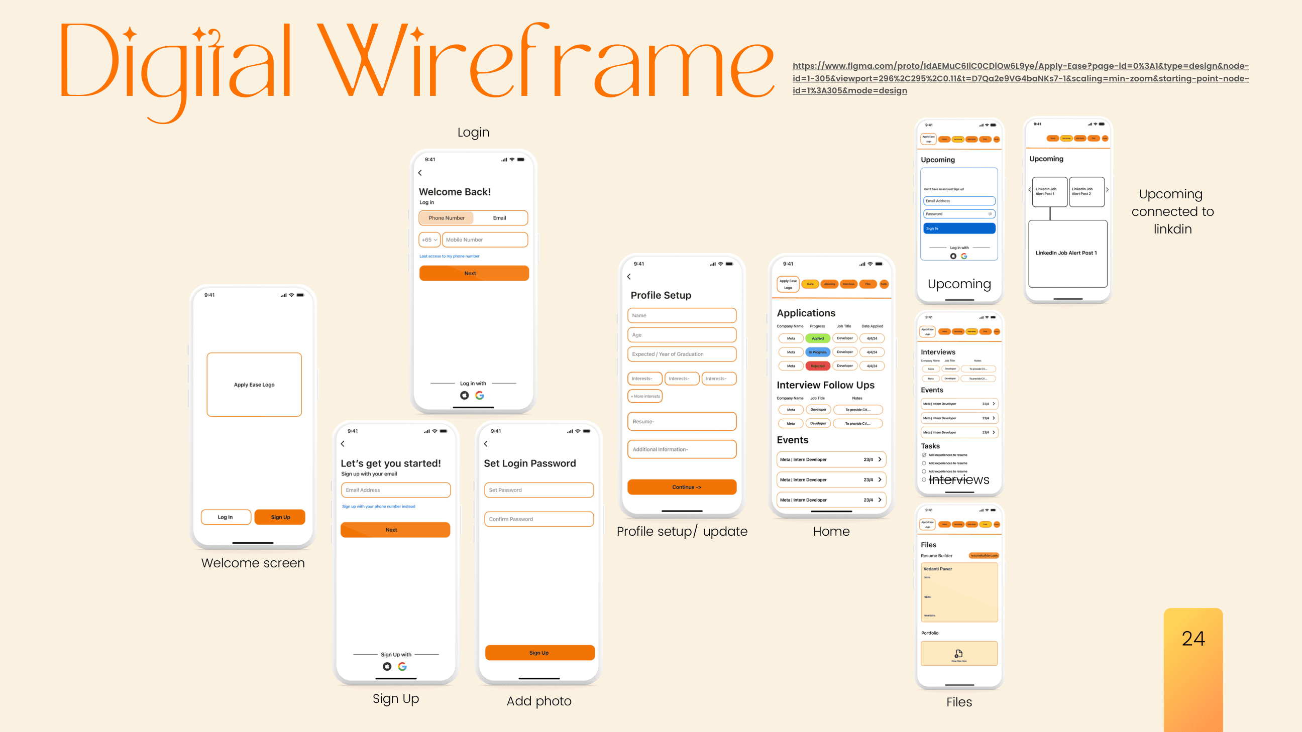
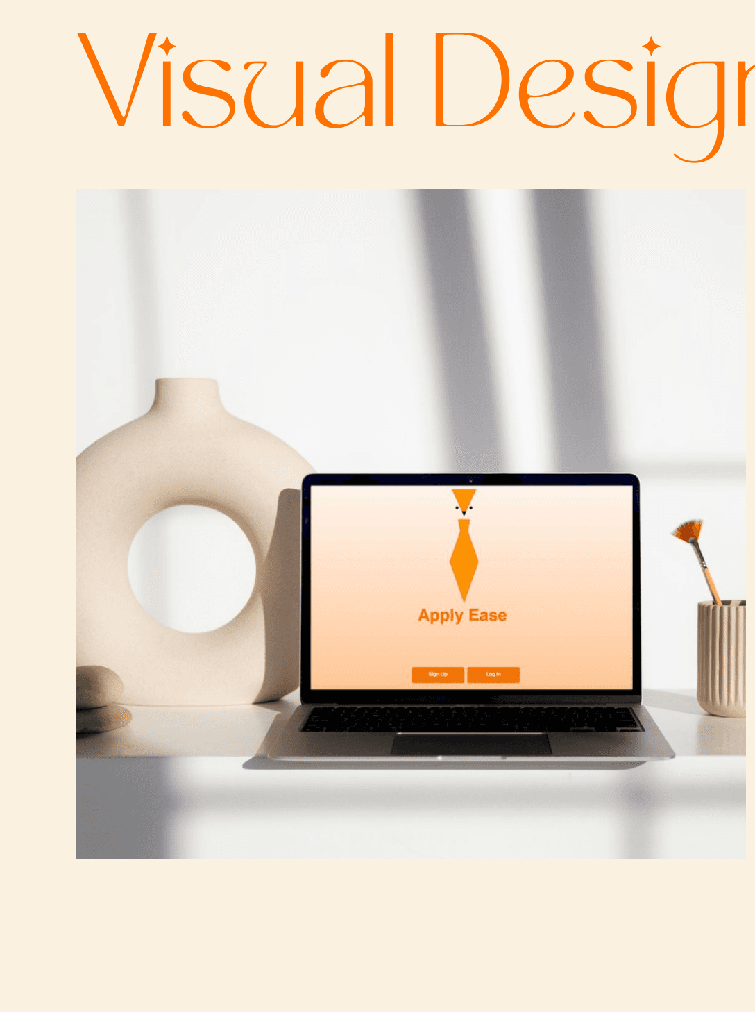
Early testers found the first digital wireframe hard to read. The final pass simplified the layout, reduced visual clutter, and carried the mascot logo and SF Pro Text through every screen for a consistent system.
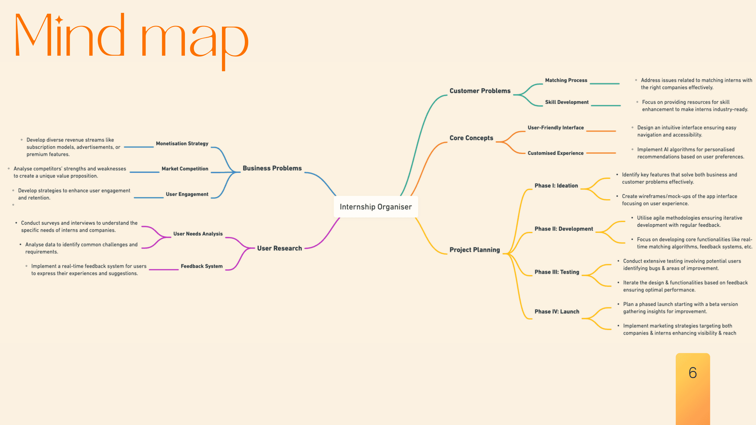
With no team to split research across, five personas had to cover both sides of the process — job seekers and a hiring-manager perspective — before a single screen was designed.
Research Insights
Every persona needed a single place to manage all their applications — not a spreadsheet, not scattered emails, not a team tool repurposed for one user.
Job seekers check application status obsessively. If it took more than a glance to read, the tool had already failed its core job.
A stressed job seeker won't sit through a tutorial. The interface had to be understood on first open, with no exceptions.
Resumes, cover letters, and transcripts scattered across email and downloads was a recurring, specific complaint across every persona interviewed.
Prototyping & Testing
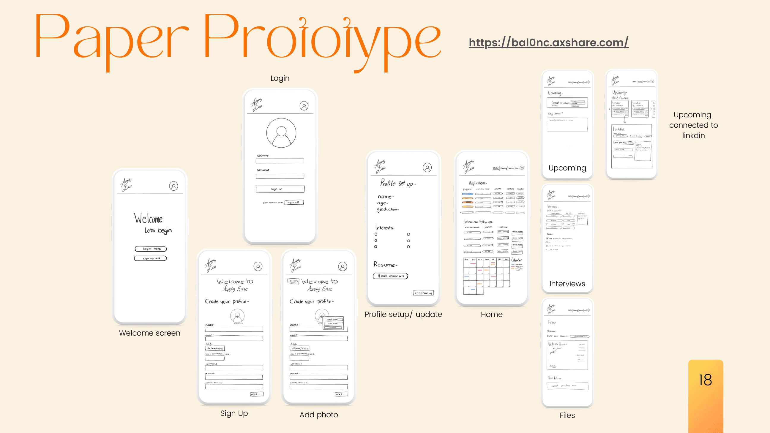
Hand-drawn paper prototypes for every core screen, tested and rebuilt as a digital Figma wireframe, then refined into the final visual system — each pass driven directly by usability feedback. One tester's reaction: "I will definitely use this app for organising my internships."
Design System & Final Presentation
A small, consistent visual system — carried across every screen rather than styled per-page.
Conclusion
Apply Ease proved that a solo-run process — research, design, and testing owned end to end — can still produce a system disciplined enough for a real, consistent product.